Tag Archives: Tinkercad

Transitioning from TinkerCad to Blender with CAD Sketcher

Posted 6 August 2022

I have been been doing 3D printing (a ‘Maker’ in modern jargon) for almost a decade now, and almost all my designs started out life in TinkerCad – Autodesk’s wonderful online 3D design tool. As I mentioned in my 2014 post comparing AutoDesk’s TinkerCad and 123d Design offerings, TinkerCad is simple and easy to use, powerful due to its large suite of primitive 3D objects and manipulation features, but runs out of gas when dealing with rounded corners, internal fillets, arbitrary chamfers and other sophisticated mesh manipulation options.

Consequently, I have been keeping an eye out for more modern alternatives to TinkerCad – something with the horsepower to do more sophisticated mesh modeling, but still simple enough for an old broke-down engineer to learn in the finite amount of time I have left on earth. As I discovered eight years ago, AutoDesk’s 123D Design offering wasn’t the app I was looking for, but Blender, with the newly introduced CAD Sketcher and CAD Transforms add-ins, may well be. Blender seems to be aimed more at graphic artists, animators, and 3D world-builders rather than for the kind of dimension-driven precision design for 3D printing, but the CAD Sketcher and CAD Transforms add-ons go a long way toward providing explicit dimension-driven precision 3D design tools for us maker types.

I ran across the Blender app several months ago and started looking for online tutorials; the first one I found was the famous ‘Donut Tutorial’ by Blender Guru. After several tries and a large amount of frustration due to the radical GUI changes between Blender 2.x and 3.x, I was able to get most of the way through to making a donut. Unfortunately for me, the donut tutorial didn’t really address dimension-driven 3D models at all, so while the tutorial was kinda fun, it didn’t really address my issue. Then I ran across Maker Tales Jonathan Kobylanski’s demo of the CAD Sketcher V0.24 Blender add-on, and I became convinced that Blender might well be a viable TinkerCad replacment.

So, I worked my way through Jonathan’s CAD Sketcher 0.24 tutorial, and as usual got in trouble several times due to my ignorance of basic Blender GUI techniques. After posting about my problems, Jonathan was kind enough to point me at his paid “How To Use Blender For 3D Printing” 10-lesson series for $124USD. I signed right up, and so far have worked (and I do mean worked!) my way through the first six lessons. I have to say this may be the best money I’ve ever spent on self-education (and at my advanced age, that is saying a LOT 🙂 ). In particular, Jonathan starts off with the assumption that the student knows absolutely NOTHING about Blender (which was certainly true in my case) and shows how to set the program up with precision 3D modeling in mind. All lessons are extensively documented, with video, audio, and all keypresses fully described. At first I was more than a little intimidated by the deluge of short-cut keys (and still am a little bit), but Jonathan’s lessons expose the viewer to slightly more bite-size chunks than the normal fire-hose method, so I was able to stay more or less on the same continent with him as he moved through the design step. I also found it extremely helpful to go back through the first few lessons several times (very easy to do with the academy.makertales.com lesson layout), even to the point of playing and replaying particular steps until I was comfortable with whatever procedure was being taught. There is a MakerTales Discord server and a channel dedicated to helping academy students, and Jonathan seems to be pretty responsive in responding to my (usually clueless) comments and pleas for help.

Jonathan encourages his students to go beyond the lessons and to modify or extend the particular focus of any lesson, so I decided to try and use Blender/CAD Sketcher for a small project I have been considering. My main PC is a Dell XPS15 laptop, connected to two 24″ monitors via a Dell WD19TBS Thunderbolt docking station. I have the monitors on 4″ risers, but found they still weren’t high enough for comfortable viewing and seating ergonomics, so I designed (in TCAD, several years ago) a set of riser risers as shown in the image below
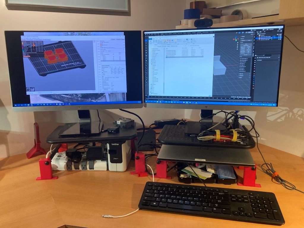
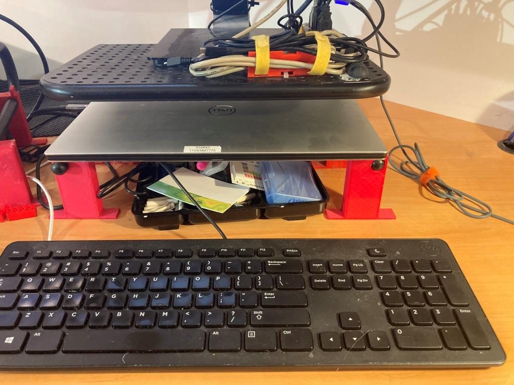
My two-display setup. Note the red ‘riser elevators’ under the metal display risers
Closeup showing the built-in shelf for my XPS 15 laptop

As shown above, the ‘riser elevator design incorporates a built-in shelf for my XPS15 laptop. This has worked well for years, but recently I have been looking for ways to simplify/neaten up my workspace. I found that I could move my junk tray from the side of my work area to the currently unused space underneath my laptop, but with the current arrangement there isn’t enough clearance above the tray to see/access the stuff in the back. I was originally thinking of simply replacing the current 3D printed risers with new ones 40mm higher, but in an ‘aha!’ moment I realized I didn’t have to replace the risers – I could simply add another riser on top. The new piece would mate with the current riser vertical tab that keeps the laptop from sliding sideways, and then replicate the same vertical tab, but 40mm higher.

Doing either the re-designed riser or the add-on would be trivial in TinkerCad, but I thought it would be a good project to try in Blender, now that I have some small inkling of what I’m doing there. So, after the normal number of screwups, I came up with a fully-defined sketch for a small test piece (I fully subscribe to Jonathan’s “When in doubt – test it out” philosophy), as shown:
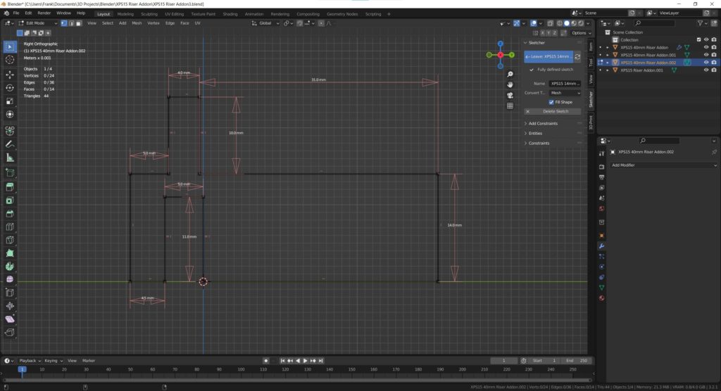
CAD Sketcher sketch for the test piece. Same as the final piece, except for height

I then 3D printed on my Prusa MK3S printer. Halfway through the print job I realized I didn’t need the full 20mm thickness to test the geometry, so I stopped it midway through and placed it on top of one of the original risers, as shown in the following photo:
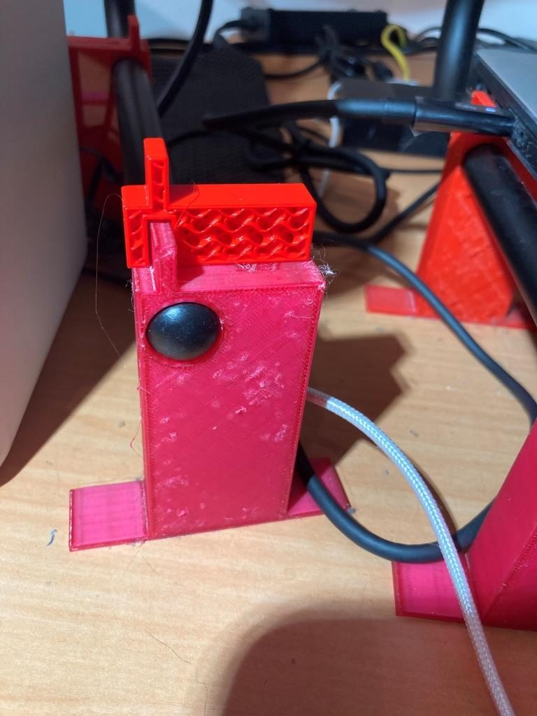
Maybe not completely perfect, but still a pretty good fit

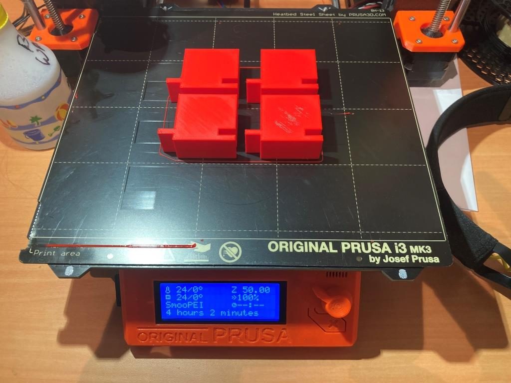
After convincing myself that the design was going to work, I modified the sketch for the full 40mm height I wanted, and printed 4ea out, as shown:
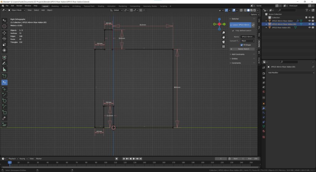
CAD Sketcher sketch for the full-height version
4ea full-size riser add-on pieces

After installation, I now have my laptop higher by 40mm, and better/easier access to my junk tray as shown – success!
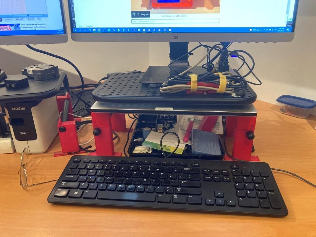
Finished project. Laptop higher by 40mm, junk tray now much more accessible

And more than that, I have now developed enough confidence in Blender/CAD Sketcher to move my 3D print designs there rather than relying strictly on TinkerCad. Thanks Jonathan!

16 August 2022 Update:

Just finished Learning Project 7: Stackable Storage Crate, and my brain is bulging at the seams – whew! After finishing, I just had to try printing one (or two, if I want to see whether or not I really got the nesting geometry right), even though each print is something over 13 hours on my Prusa MK3S with a 0.6mm nozzle. Here’s the result:
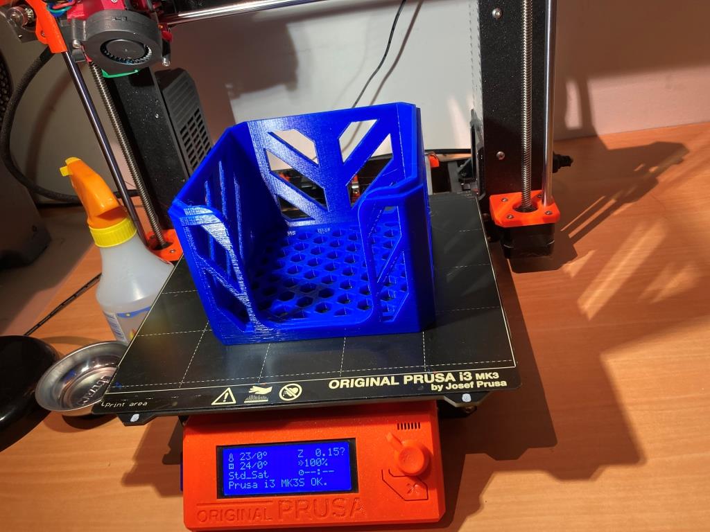
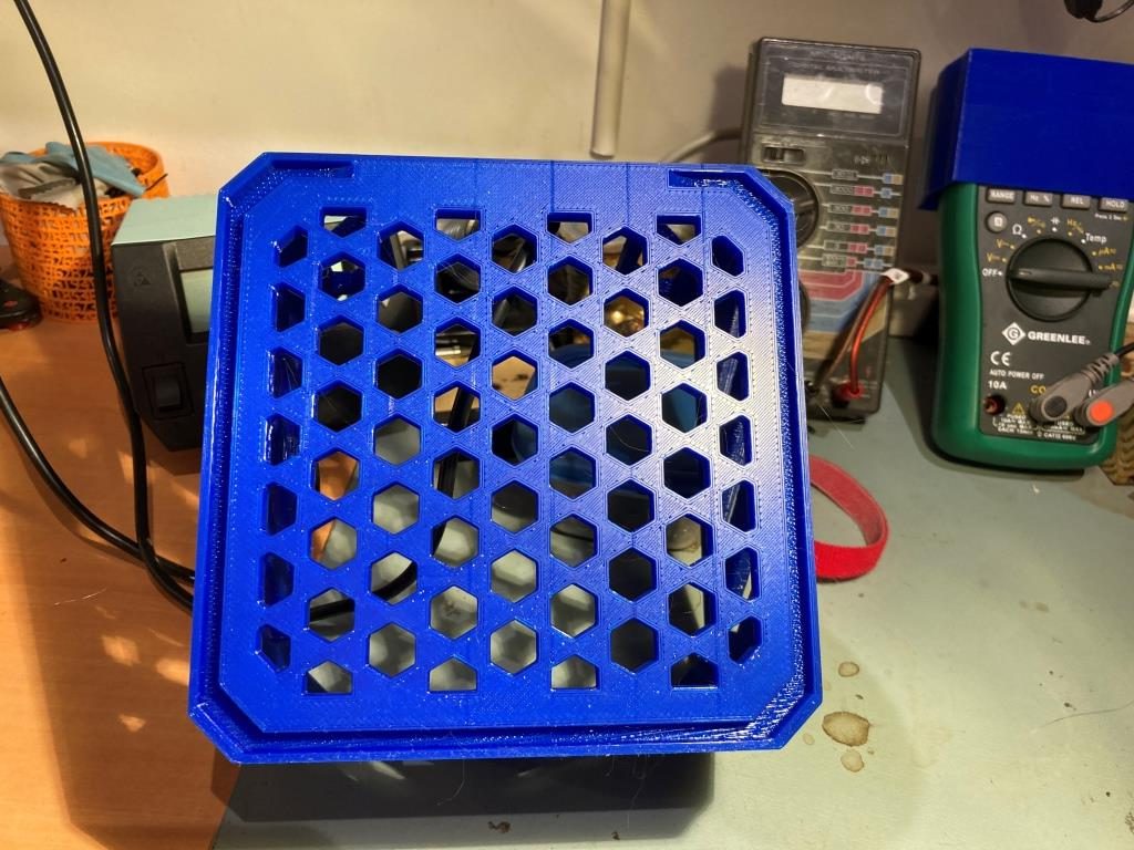
Hot off the printer – after “only” 13 hours!
Underside showing stacking groove. Printed without supports, just using bridging

Frank

3D Printed Terminal Strip Cover/LED Bracket

Posted 11/21/15

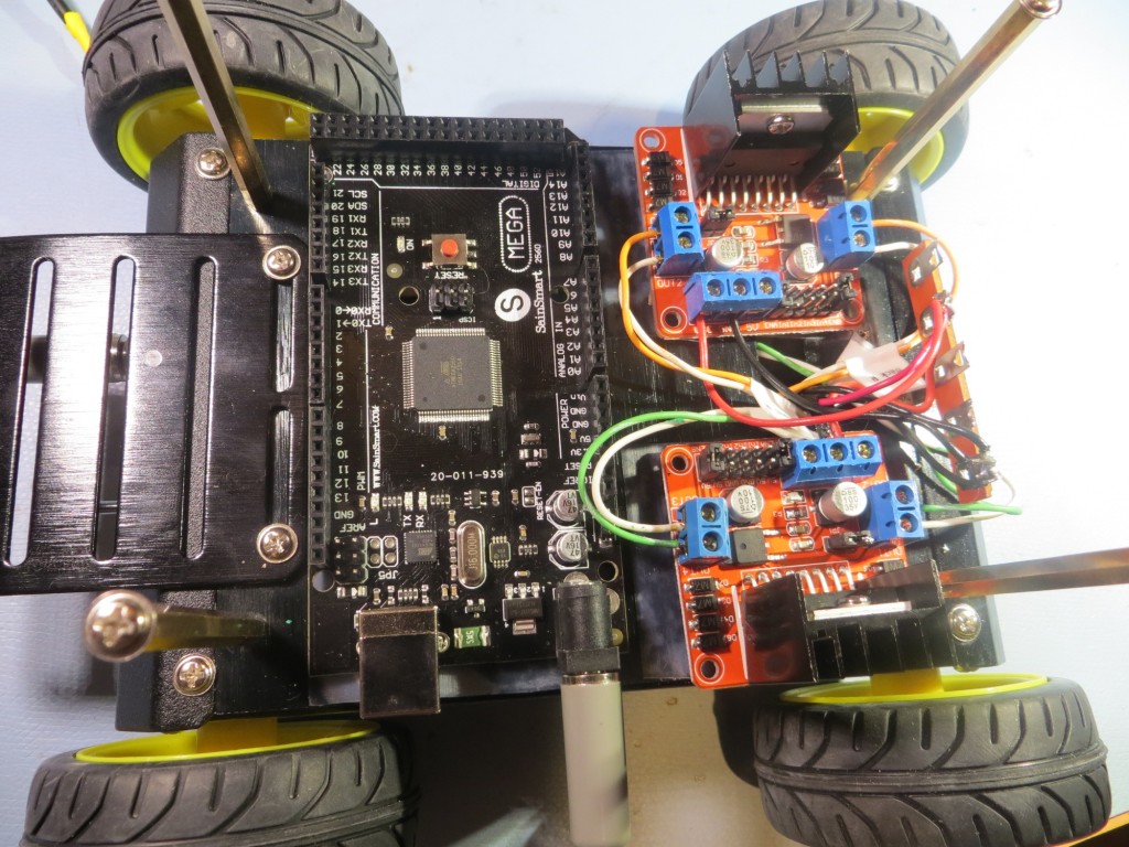
In the process of building up my 4 wheel drive replacement for Wall-E, I ran across a problem that turned out to be a perfect showcase for the power of home 3D printing.  The problem was what to do with a terminal strip mounted at the rear of the robot chassis, as shown in the photo below.  Interestingly, the terminal strip itself is sort of a story of its own; it  is from the bygone era of point-to-point wired electronics, and they aren’t readily available anymore, even though they are perfect for this sort of robotics project.  I had this one left over from some 20-year old project, and when I tried to find a source for re-supply, I almost struck out entirely.  I finally found a source at Surplus Sales of Nebraska  – add this one to your bookmarks!

4WD Robot with old-style terminal strip shown at the rear (right side in this photo) of the chassis

4WD Robot with old-style terminal strip shown at the rear (right side in this photo) of the chassis

OK, so the problem is – the terminal strip is great for what it is doing, but now I have Vbatt, +5V, and GND all exposed where an errant wire or screwdriver could cause real problems – what to do?  Moreover, I needed some way of labeling the strip, because I now had two sets of red wires (one from the battery pack, one from regulated +5), and without some obvious and permanent labeling scheme, I was for sure going to screw this up at some point.  Before the recent advent of 3D printing and the ‘maker’ revolution, this would have been a real show-stopper.  I could have maybe found a small plastic box that I could cut down or reform somehow, or milled something fancy from a block of Lexan, but the cut-down box wold be inelegant to say the least, and the fancy milled piece of Lexan would be exorbitantly expensive and time-consuming, even assuming that I got it right the first time (unlikely).  However, now that I have the super-power of 3D printing at my fingertips, I “don’t need no stinking Lexan!”.  All I need is  my imagination, TinkerCad, and my PowerSpec 3D Pro dual-extruder printer!

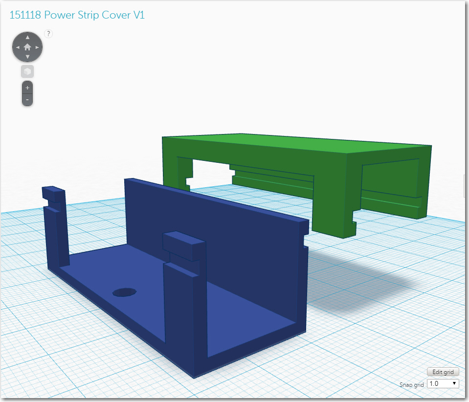
So, using my imagination and TinkerCad, I rapidly sketched out a design for a U-shaped protective shroud for the terminal strip, and printed it out.  Once I had it mounted, I realized that I had only done half the job – literally!  The U-shaped shroud protected the terminal strip from the front, but not from the top – I needed a lid of some sort to finish the job.  Having a lid meant there had to be some way of keeping the lid on, while still being able to easily remove it to make changes to the strip wiring, so I needed some sort of snap-action latching mechanism.  This resulted in the design  shown in the following photo.  The U-shaped shroud is shown in blue, with the lid shown in green.  the complementary groves allow the lid to snap onto the trough.

Early version of the power strip cover and lid

Early version of the power strip cover and lid

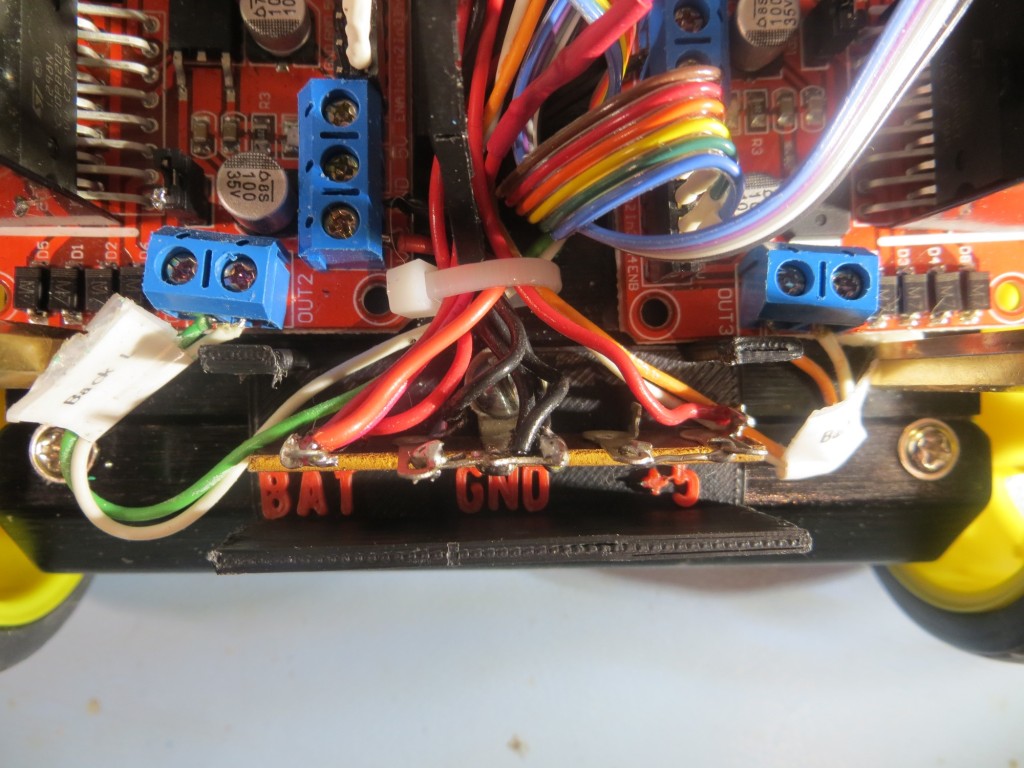
In another hour or so, I had both parts printed up and mounted on the robot – and it worked great!  However, as often happens when I design and print 3D parts, I immediately saw possibilities for improvements.  The first idea was to incorporate the labeling right into the shroud design, literally.  I have a dual-extruder printer, so that meant that I could put the ‘Vbat’, ‘GND’ and ‘+5’ labels directly into the material, in a contrasting color – cool!  In another hour or so, I had the labels incorporated into the design and another piece printed out, with the result shown below

View showing the bottom part of the two-part cover, with integrated terminal labels

View showing the bottom part of the two-part cover, with integrated terminal labels

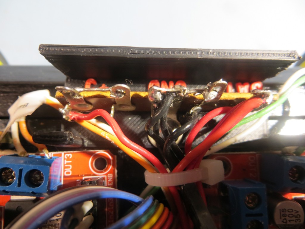
Another view of the bottom part of the two-part cover

Another view of the bottom part of the two-part cover

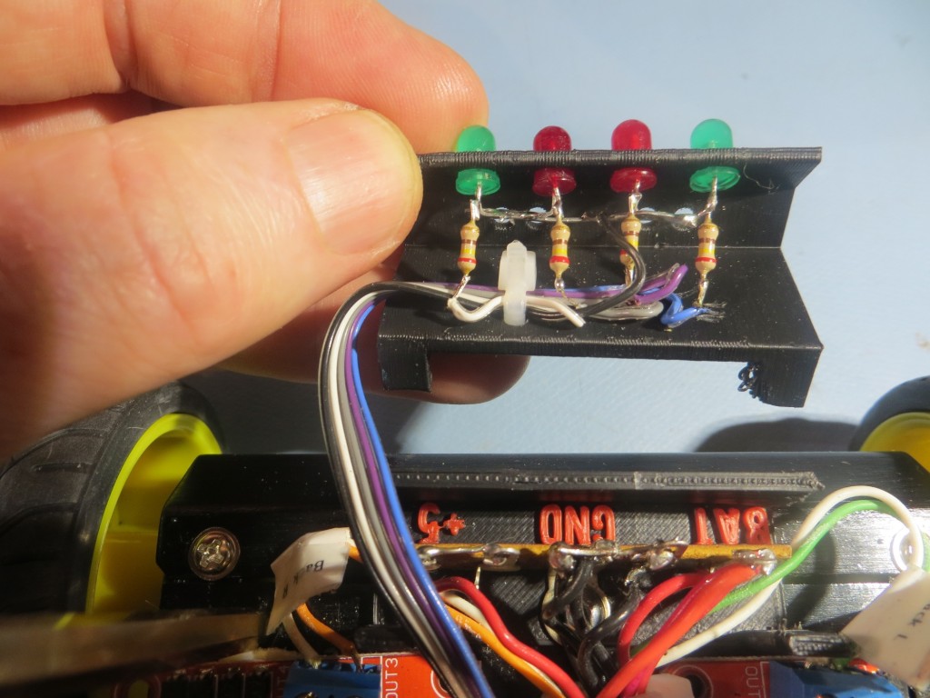
After admiring my work with the integrated labeling, and the way the lid snapped on and off firmly but easily, I had another cool thought.  Wall-E has a set of 4-LED’s mounted at the rear of its chassis, and the software uses these to announce  various program states, and I wanted to do the same thing for the new 4WD robot.  However, I had not yet figured out where I was going to put them, and it suddenly occurred to me that  I could use my new terminal strip cover  as the platform for some readout LED’s – cool!

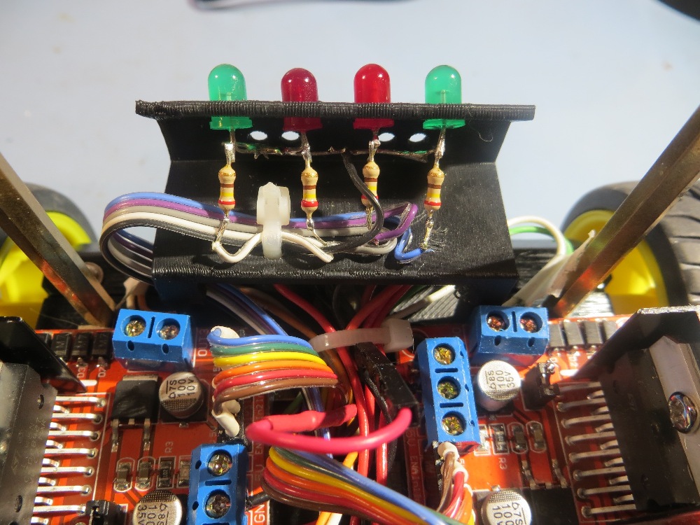
So, in another hour or so I had yet another version designed and  printed out and installed on the robot chassis, as shown in the photos below


Inside view of the top part of the two-part terminal strip cover, showing the LED array installation

Inside view of the top part of the two-part terminal strip cover, showing the LED array installation

LED Array/Terminal strip cover snapped onto the bottom half

LED Array/Terminal strip cover snapped onto the bottom half

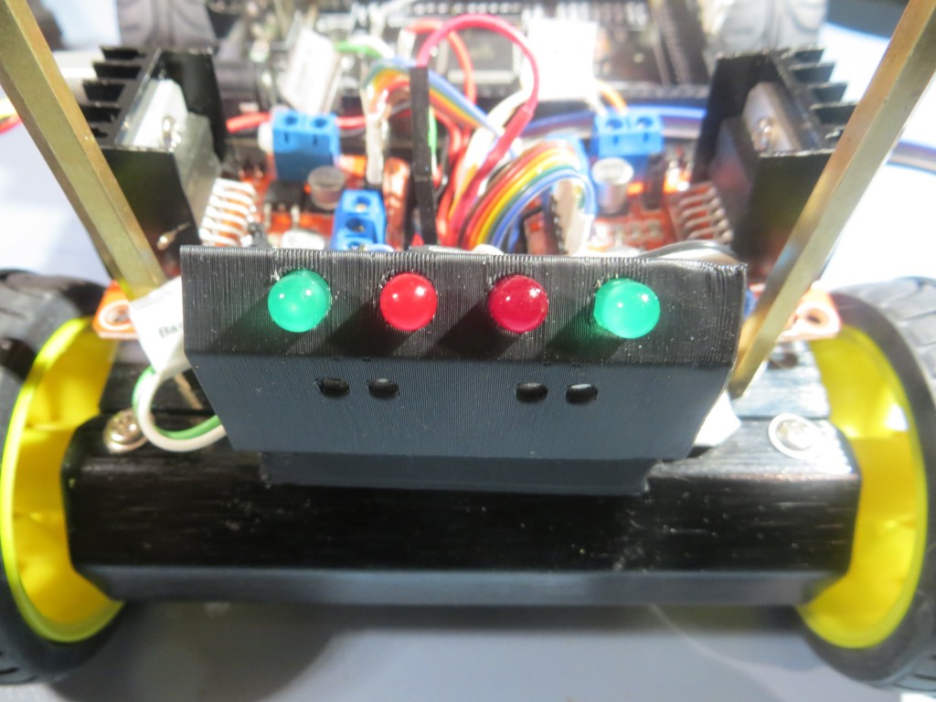
4WD Robot rear view showing the completed cover/LED array bracket

4WD Robot rear view showing the completed cover/LED array bracket

So, in the space of a day or day-and-a-half, I went  through a half-dozen or so design iterations, all the way from initial (incomplete) concept and (wrong) implementation, through several completely unforeseeable concept/idea mutations to a ‘final’ (to the extent that anything is final on one of my projects!) implementation that not only solved the original problem (covering the exposed wiring on the terminal strip, but also  implemented integrated labeling AND added a completely new and desirable feature – the LED array bracket.

Although this little project is no great shakes in the grand scheme of things, it does serve to illustrate how the combination of essentially infinite computing power, easy-to-use design tools like TinkerCad, and cheap, capable 3D printing tool availability is revolutionizing the hardware/software  development world.  40  years ago when I was a young electronics design engineer, there was a huge gap, in money and time, between a working prototype and a finished production design.  And, once the production process started, changes rapidly became impossible due to the cost and time penalties. So, everybody tried to ‘get it right’ the first time, and many really cool ideas didn’t get incorporated because they occurred too late in the design-production cycle.  Now, many of these constraints no longer apply, at least not for small production volumes; we now able to operate more like the ‘cut-and-try’ generation of the early 20th century.  No need to worry too much about which design alternative(s) is/are better when material costs are negligible and design-fabricate-test cycles are shorter than the time required to do a detailed analysis – just build them all and compare them ‘in the flesh’.

Many years ago when I was an active soaring (full-size glider) pilot, I wrote a book  (“Cross Country Soaring With Condor”)  about the use of a popular soaring simulator as a competition trainer.  When it came time to get the book published, I did a lot of research and eventually settled on an outfit called ‘DiggyPOD’, where the ‘POD’ stands for ‘Printing On Demand’. These folks had figured out how to eliminate most of the up-front publishing costs that made traditional book publishing inaccessible to all but established authors and professors with guaranteed markets. Consequently, I was able to get my book published in quantities and at prices that allowed me to make a profit selling into a very restrictive niche market.  I think the same sort of thing is now happening in the realm of small volume consumer products.  Not only is it now possible to conceive, design, and implement new products at very low cost and without any costly infrastructure, it is also possible to  customize  existing products in ways that would have been unimaginable 10 years ago.  For instance, I recently repaired a friend’s bicycle accessory.  This is something that would have been impossible before.  I think this ‘maker’ revolution is going to change our world in ways we can’t even begin to imagine!

Stay tuned,

Frank


TinkerCad vs 123d Design vs MeshMixer – Pick your Poison

I started into the 3D Printing world just a few months ago with a PrintrBot Metal 3D printer, a strong commitment to learn, and and very little else.  Since then I have spent countless hours with the printer and several different 3D CAD applications to design and instantiate various 3D designs.  In the process I have learned a LOT about AutoDesk’s Tinkercad, 123d Design, and MeshMixer  applications. These are all free applications that purport to make it easy and intuitive to create 3D designs for 3D printing, and  all three offer some amazing capabilities and features for free apps.  Unfortunately, it can also be very frustrating to discover that after many hours trying to incorporate some specific feature into your 3D design, ‘you can’t get there from here’ and you are left high and dry with nowhere to go.  MeshMixer is such a different program than either 123d Design or Tinkercad that I don’t plan to discuss it in this post – maybe later.

I have decided to coin the phrases ‘linear frustration’ and ‘Nonlinear frustration’ to describe the differences between 123d Design and Tinkercad.

Linear Frustration (aka Tinkercad)

Tinkercad is an absolutely amazing 3D design application.  It has a very intuitive GUI, and it takes almost no time to become proficient and productive with its very simple set of primitives along with a robust set of manipulation features  (WorkPlane, Group/Ungroup, Adjust/Align, and Solid/Hole).  The Workplane concept is particularly powerful in that it allows you to quickly define the plane on which the next primitive will be placed and manipulated.  This makes it child’s play to construct fairly complex objects in rotated and/or displaced local coordinate systems.  Unfortunately, Tinkercad runs out of gas fairly quickly when designs require sophisticated treatment like morphing from one shape to another (an ellipse to a rounded rectangle in my case), or when reshaping objects after rotation.   This  is  what I refer to as a ‘Linearly Frustrating’ in that the  problem isn’t  so much a failure of the package as much as a limitation on how much you can do with the limited suite of  primitives and manipulation tools offered.  Every tool does what it is supposed to, but the combination doesn’t allow an infinite pallet of options.  With added work and persistence you can go a LONG ways with Tinkercad, but eventually the law of diminishing returns will get to you and you’ll be looking for something else with more horsepower.

There are a couple of other frustrations with Tinkercad that have more to do with the way designs are stored and managed; I’m a complete neat-freak when it comes to project file organization, so this is a big deal for me.

  • although Tinkercad offers the ability to assign  collections of designs to  a ‘Project’ folder, all Tinkercad does is create a soft link from the corresponding design in the ‘All Design’  collection to the Project view. This means that if you happen to edit, or god forbid  delete the ‘All Designs’ design, the ‘Project’ design gets deleted too – ouch!  The ‘Project’ idea is nice, but it is basically useless unless designs are  copied to Project folders rather than just linked.
  • Along the same lines, there is apparently no way to copy or delete multiple designs at once.  I have over 150 designs now, but many of them are early versions that I no longer need; it would be pretty nice if I could multi-select designs for deletion.
  • And last, but not necessarily least – Tinkercad is apparently a victim of its own success, as the Tinkercad server(s) have been unreliable of late due (I think) to extremely high  activity levels.  Maybe Autodesk should consider fixing some of the more egregious problems with 123D Design (see below) so more of us would move off Tinkercad and onto 123D Design ;-).

Non-Linear Frustration (aka 123d Design)

And along comes AutoDesk 123d Design… I swear this app represents Yin and Yang, Good and Evil, Blissful Marriage and Ugly Divorce, Superman and Kryptonite, Batman and The Joker and all the other polar opposites you can think of, wrapped into one super-powered but fatally flawed 3D design program

Whoever was in charge of implementing the GUI (Graphical User Interface) for 123d Design gets my vote for Evil of the Century.  The very first mouse-driven user interface was created back in the late 1960s by Douglas Engelbart, at Stanford Research Institute, and ever since then the GUI has been evolving.  It used to be that ‘bad’ GUIs abounded, with weird menu modalities and nonsensical procedural rules, but these evolutionary dead-ends have been mostly driven extinct.  GUI paradigms  have now evolved to be nearly universal, to the point where humans can transition from one program to another with very little effort.  Everyone expects and demands top-level menus that are activated with a left click, context menus that are activated with a right-click, and so on.  Programs that don’t conform to that expectation immediately create a cognitive dissonance in the mind of the user, who now has to spend processing power just trying to figure out how to talk to the program, rather than how to transfer the 3D image in his/her brain onto the drawing canvas.  Imagine you have rented a car at some distant airport, and you discover that the steering wheel is connected to the wheels in such a way that turning the steering wheel to the right causes the road wheels to turn to the left, and vice versa.  It has been proven over and over again that it is virtually impossible for humans to recover from a crossed-control situation like this, even if they know up-front that the condition exists!  This is because they have gotten so used to subconsciously controlling steering in one way that the car is off the roadway and into the ditch before the driver even realizes something is wrong.  Thus, a deeply embedded interface paradigm cannot be violated without extreme consequences.  In another context I had occasion to research the results of crossed rudder pedal control accidents in aviation.  What I found was that  in every case of crossed rudder pedals, the pilot was unable to recover without crashing the plane, regardless of the experience  and/or expertise level of the pilot.  In most (but unfortunately not all) cases, the crash happened during the takeoff roll, usually without fatal results.  I belabor this topic to emphasize the dangers inherent in screwing with GUI paradigms just to be different or because the designer “has a better idea” – it may be ‘better’ but if it is too ‘different’, it will be perceived to be (and will be, in fact) worse!

In the case of 123d Design, I swear the application design team was divided into four  different sections.

  1. The math team was from India, spoke only Hindi, and worked entirely using paper and pencil.  They devised elegant and (mostly) correct transformation algorithms for things like the spectacular ‘loft’ algorithm that allows a user to morph one 2D sketch into another one, and the chamfer/fillet feature.
  2.  The object-interface  team was from Nepal, spoke only Tibetan, and used 1980s Micro-Vax machines with an early version of X-Windows to create the low-level screen widgets that expose object parameters to the user. While also mostly correct, these interface modalities died  out right along with the Micro-Vax (and for a good reason!)
  3. The main GUI team was from Mars, spoke English learned from study of “I love Lucy” and “The Jetsons”, and programmed on the latest MARC (Martian Artistic Research Center) 3D design tablets (unfortunately for us humans, MARCs inherited  their GUI paradigms from “The Jetsons” as well).
  4. The integration team was from AutoDesk, spoke Valley English, smoked pot on the weekends (and on the weekdays, and at lunch, and…) and were experts at putting lipstick on pigs.  They spent a few days and used up a 55-gallon drum of lipstick, and vioila-123d Design!
  5. The testing team – What testing team?

OK, OK it couldn’t possibly be  that bad – I’m sure the Martians had access to other TV programs too ;-).

123d Design has some wonderful features (like the ‘loft’ feature) that can be a treat to use.  Unfortunately 123d Design is also one of those evil-ridden applications where you cannot make three mouse clicks in any one direction without falling into yet another devil-spawned GUI trap of one sort or another.  To mention just one or two:

  • You can non-linearly scale any 3-D object, but you can’t non-linearly scale a 2-D object,  even though the non-linear scaling fields are exposed and can be edited!  It’s just that nothing happens when you do!  I would die from embarrassment if I had to admit I was part of a design/programming team that couldn’t even remember to connect all  the  numerical entry fields to their corresponding class variables – I mean c’mon guys!
  • When using the ‘Transformation’ (move/rotate) feature, there is a single numerical entry box presented to the user  with no label.  One has to mouse over the box to find out what it does, and what it does  changes depending on what axis you last clicked on!  So you could enter a number and discover it does exactly what you wanted – or not– depending on the recent past history of your mouse clicks.  You have to click on an axis, and then hover over the entry field to see if the hidden label now says the right thing.  This is more than stupid – it’s  EVIL!
  • When you want to open a locally saved design file on the PC version of 123d Design, it takes 3 mouse clicks instead of the one click for every other application on the planet.  First you click on ‘Open’ (well, duh!) – but then you get a dialog urging you to “Sign In!” so AutoDesk can “Access Your Projects” – NOT!!  Then you have to click on the “Browse My Computer” tab, and then you have to click on  ANOTHER ‘BROWSE’ BUTTON!!  – grrrr.  And, you have to that  every time you want open a design file on your own damned PC!!  No ‘Recent File List’, no MRU (Most Recently Used) exposure, nothing!  Even AutoDesk should be aware of the MRU concept by now!
  • The main window of the 123d Design PC version cannot be resized below a certain size, which occupies about 2/3W by 1/2H  of the real estate on my 1920 x 1080 monitor.  No other application on my PC, and almost no other application I have dealt with over the last decade or so does this.  Can you say “f###ed up”?
  • It is apparently impossible to Ctrl-C/Ctrl-V an object from one 123d Design instance to another one on the same PC – a feature that has been in every multiple-instance application since Gates and Jobs were in diapers.  In order to copy a single object to another 123d Design instance, you have to save the file containing the object, open that file in the new instance, and then delete everything but the object you wanted to copy.
  • There’s no  File Save As…  menu selection; instead you have ‘Save’ and ‘Save a Copy…’, which has ‘To My Projects…’ and ‘To My Computer’ sub-menu choices – argghhh!
  • Ctrl-A doesn’t select everything – give me a break!
  • There is  NO ALIGNMENT FEATURE!   you can group objects, you can arrange objects in circles, lines, or the Ohio State ‘Block O’ for all I know, but you cannot align them!  What kind of drawing program doesn’t have an alignment feature?  Rumor has it that the wonderful Tinkercad alignment paradigm has found its way into the iPad version of 123d Design, but not into the Windows version – the one used by about 70% of the 3D designers in the world.
  • There is no HELP!   There are lots of YouTube videos showing how to do this or that, but most were done with significantly (sometimes radically) different GUI’s from earlier versions.  Also, the videos ‘cherry-pick’ the features they like and avoid the features that don’t work (and they are  legion!).
  • The help forum sucks big time; there are at least two different forum views, and I haven’t been able to figure out which view comes up when.  Posting questions or problems is a real nightmare, and there is the infamous problem where you can write up a long post only to be confronted at the end with an error message that says ‘You can’t submit this post because you haven’t yet logged in – please log in and we’ll bring you back to this page (and if you believe that we have a bridge we’d like to sell you)”.  Every other forum package on the planet puts up the ‘not logged in’ error message  up front, or even better, simply disables the ‘Post’ button if you aren’t logged in!  And, if you do manage to finally get your post submitted, you’ll not find anyone on the other side of the curtain; Posts there have been unanswered for months if not years.

You may say that these  are trivial gripes – and I would agree with you.  Except the same sort of passive/aggressive “I know better than the rest of the universe and you can do it my way or the highway and by the way, my way doesn’t even work half the time” behavior is rampant throughout the program.  So, instead of getting nice and warm and cozy with the program, my relationship with 123d Design  is more like a series of running battles; I know I’m going to take casualties, but I need that particular feature and I have to hope I won’t get my ass completely shot off (this time) in the process.

Where to go from here?

Some posters on this subject have suggested that Autodesk has deliberately released 123d Design with such major and obvious flaws to get users hooked on  3D design so they can be sold their paid products like Fusion 360; sorta like giving away introductory  heroin doses to capture more addicts.  My personal opinion is more like ‘Hanlon’s Razor’ – “Never attribute to malice that which is adequately explained by stupidity”.